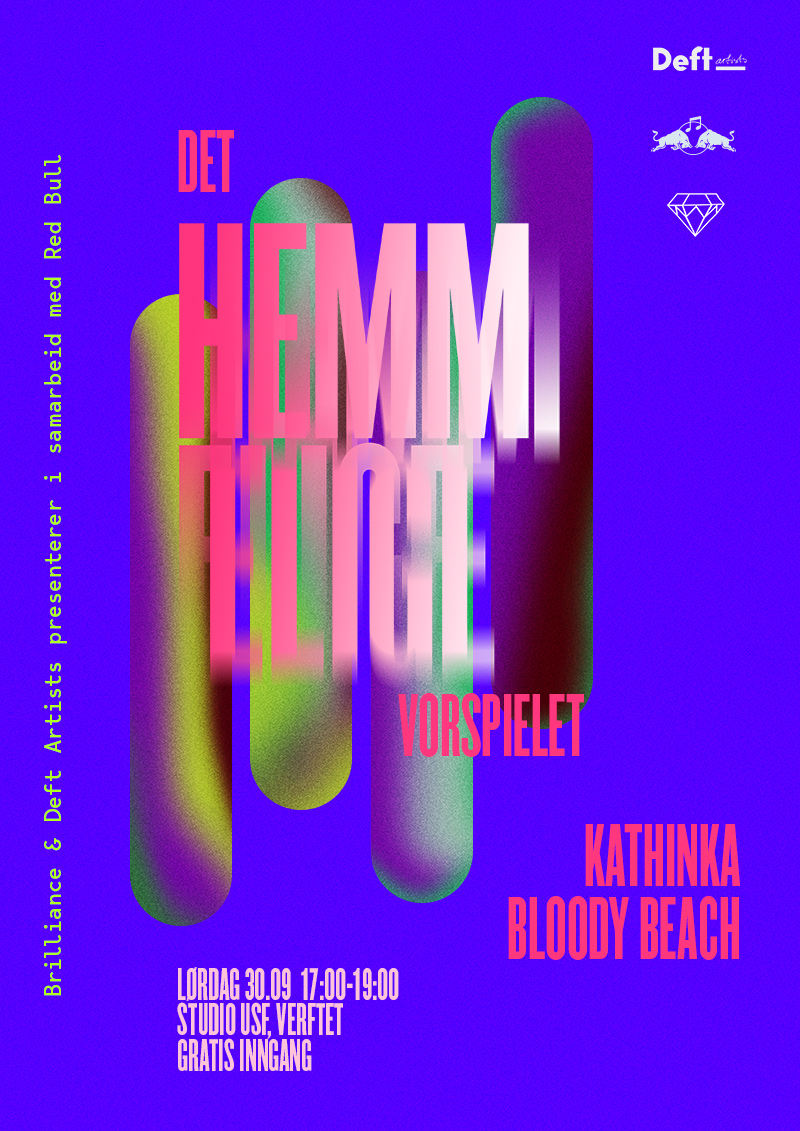
DOT Identity
MISSION-STATEMENT.txt
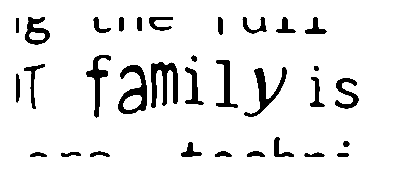
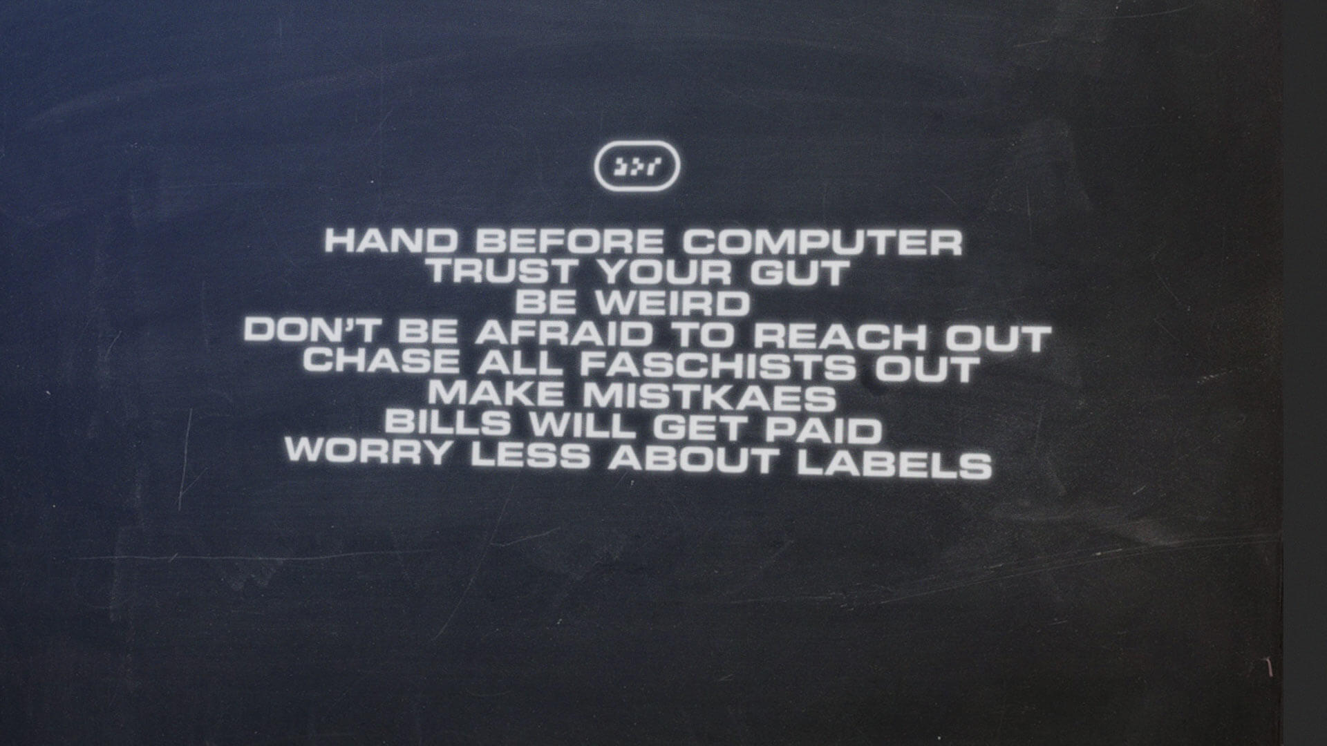
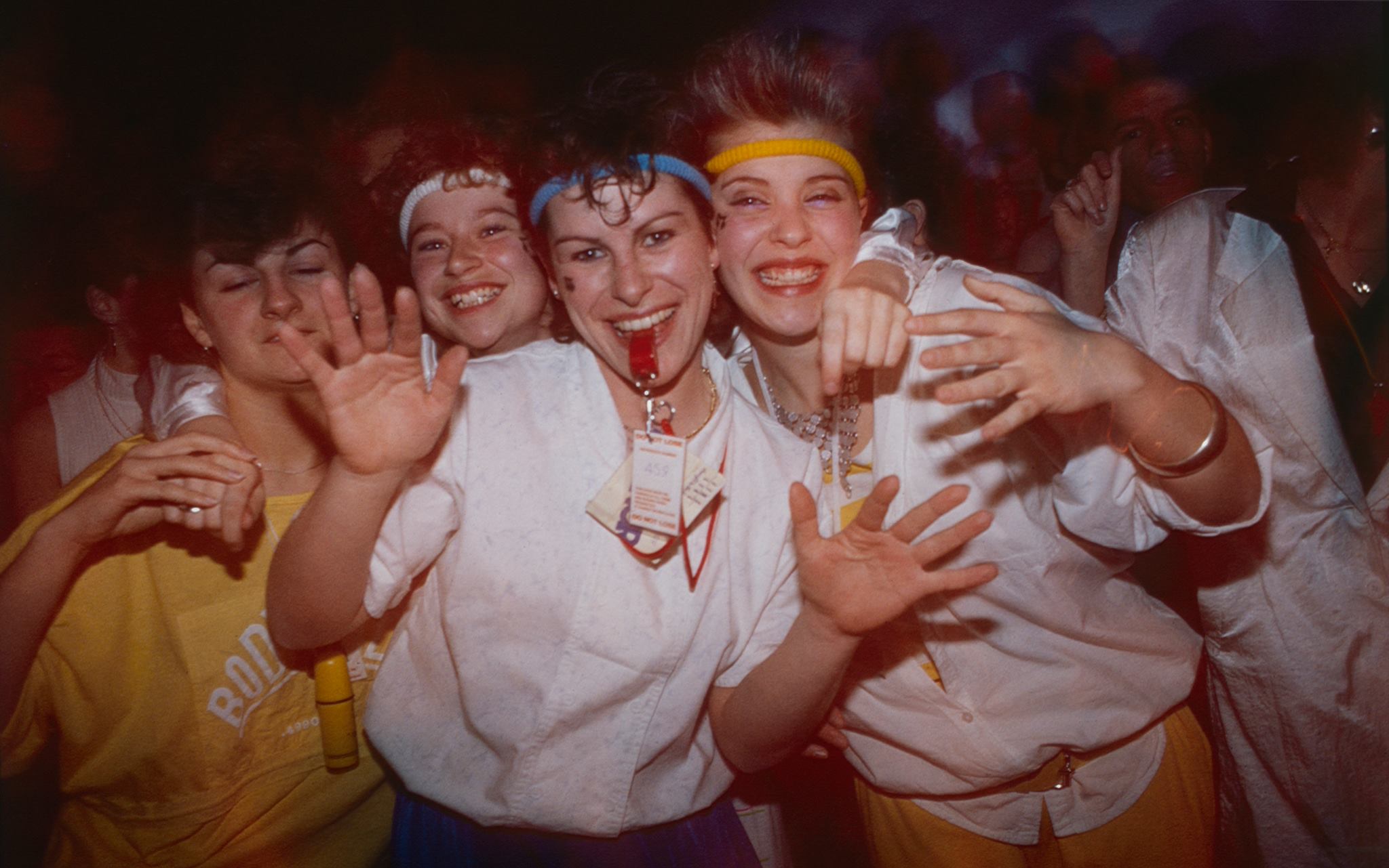
We believe people want unique experiences, discoveries and adventures. Both pleasant and provocative. We believe in being challenged. That’s why at DOT we work towards a mix of music, dance, visual art, physical art and inventions. We want to combine all of it, putting the full experience to the test. The DOT family is about experimenting with interiors, techniques and narratives. DOT is about new spaces. And we hope to meet you there. DOT is a collective of artists, DJs and organizers. We make techno events in its broadest sense.
Phase 1: initiate
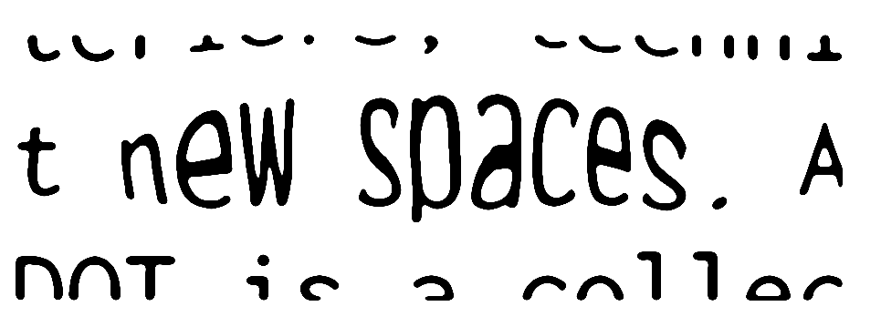
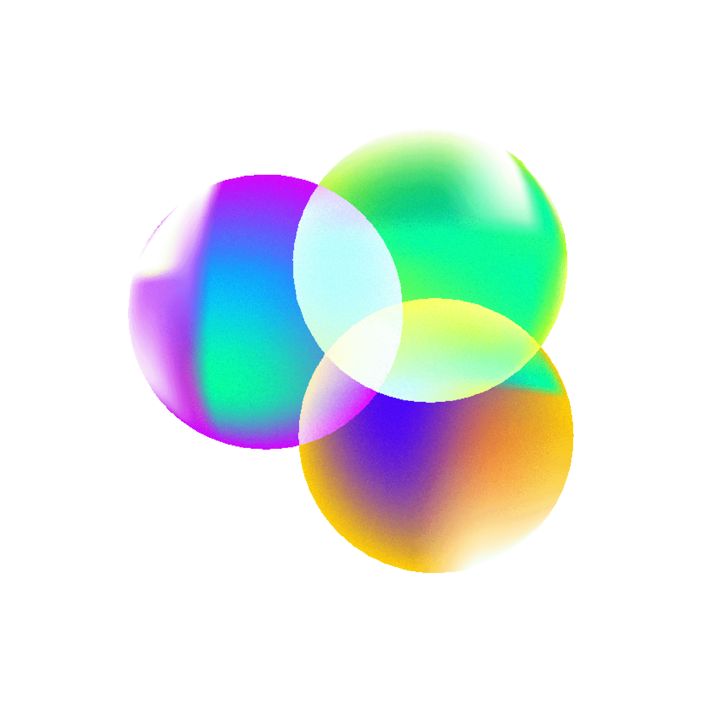
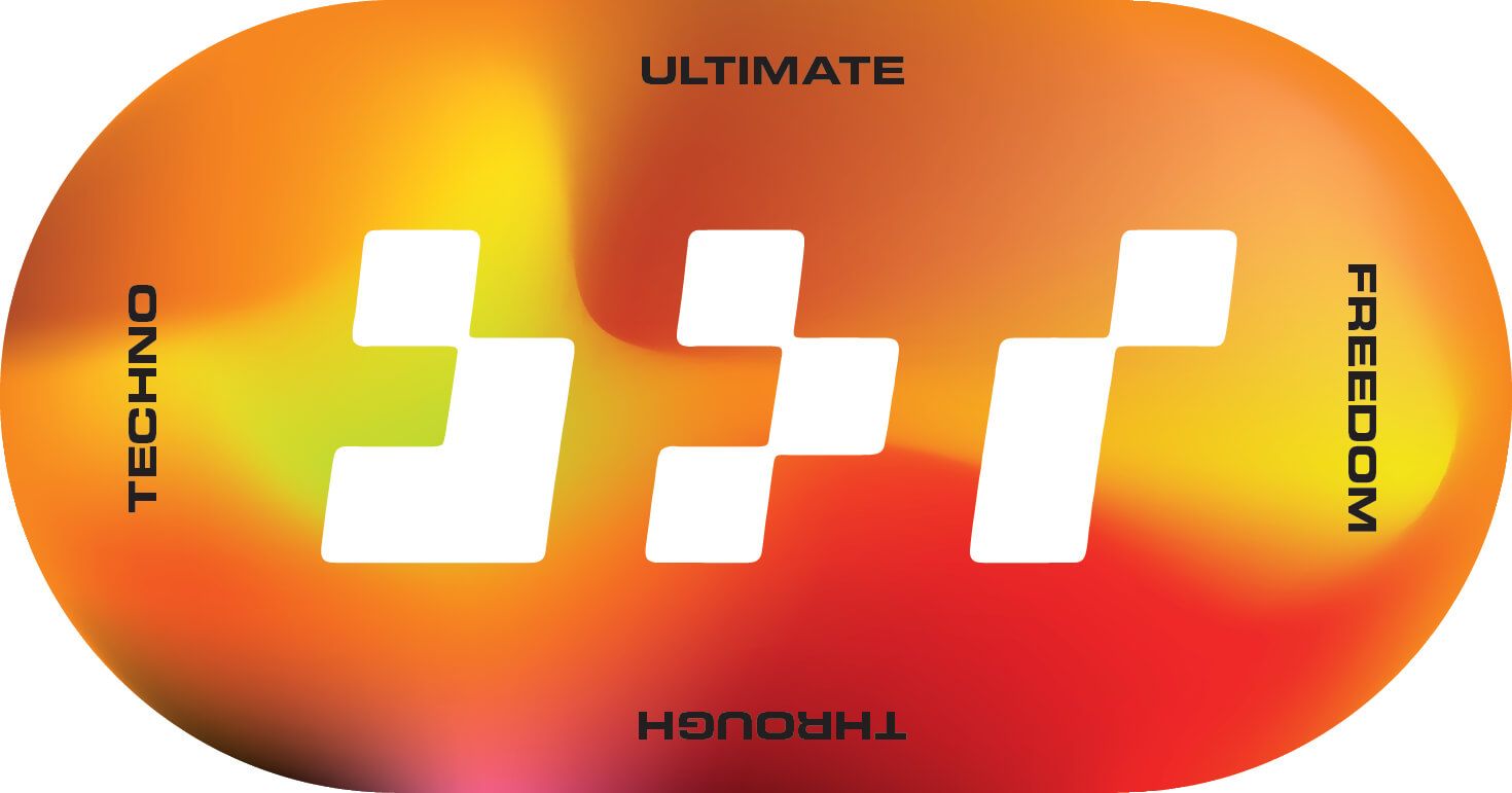
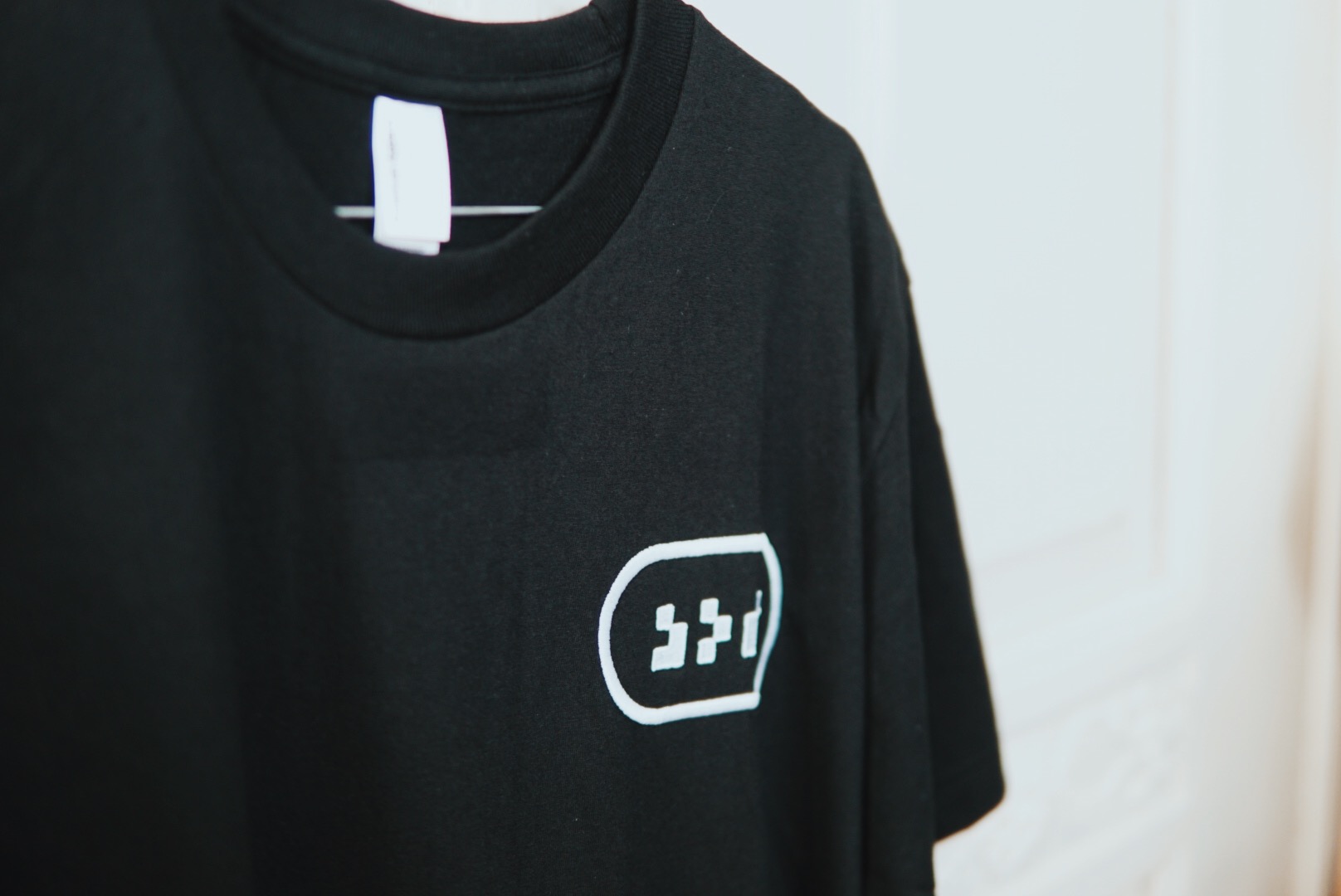
1.1: “DOT is about new spaces”
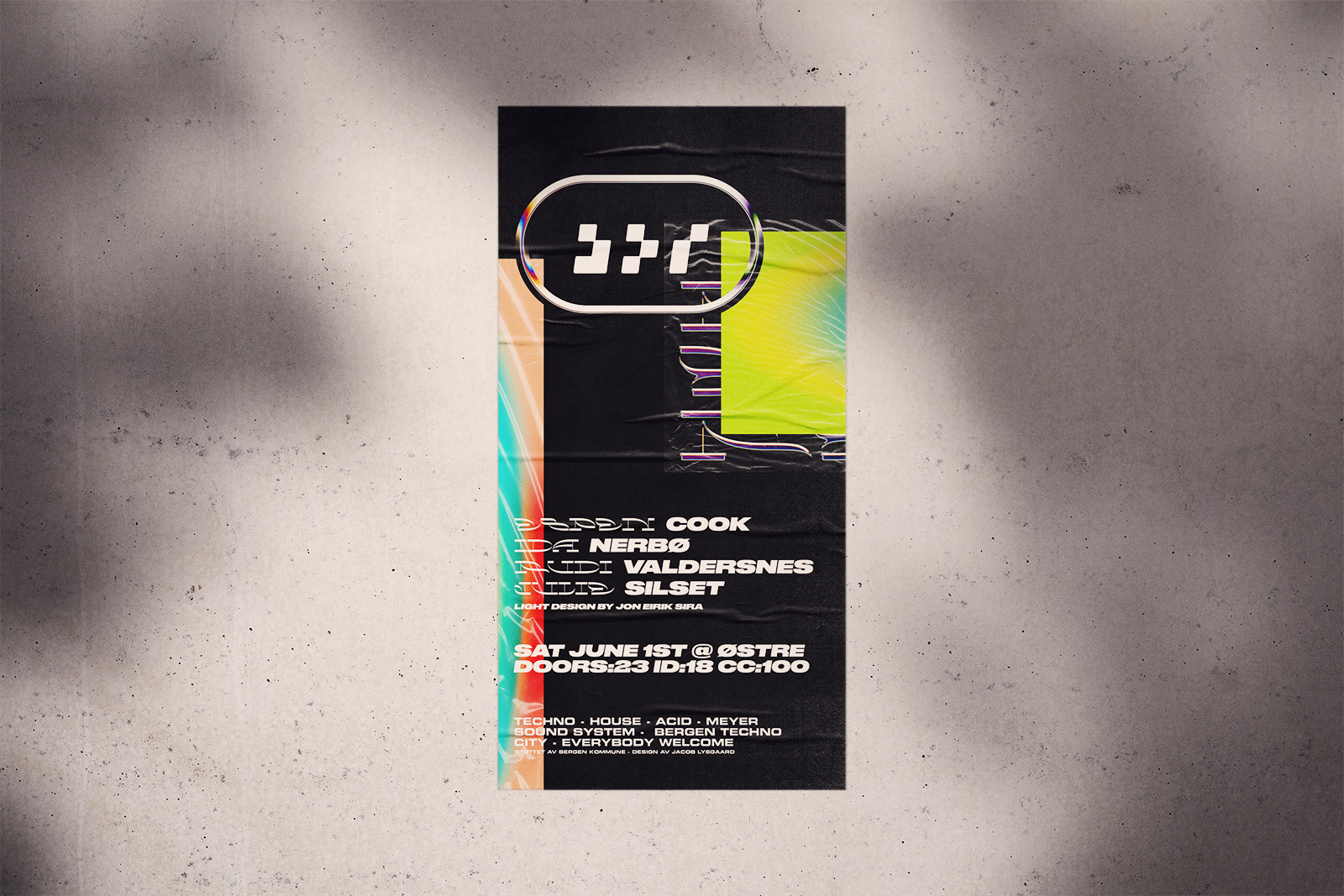
Starting with a cube, representing space, we express the wordmark on a simple pixel grid, reminiscent of early computing.


1.2: “Provocative”
Compressed and simplified, the wordmark becomes increasingly distinct and illegible. It should be a little hard to decipher, but once you get it, you’ll remember it.

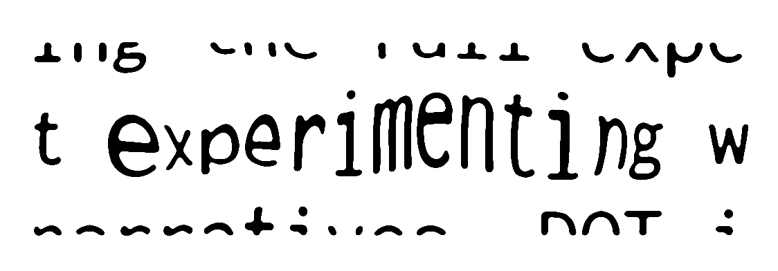
1.3: “Experimenting”
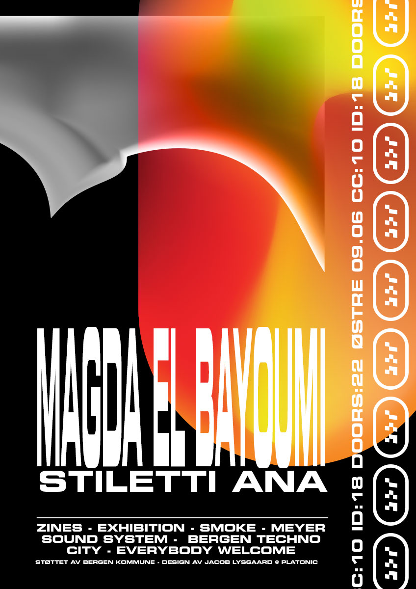
The wordmark is run through a series of processes involving printing and re-digitization, releasing it from the grid

1.4: “Family”
DOT is about being a safer space, where no-one should need to look over their shoulder. We incorporated a holding shape from Japanese heraldry to indicate a family crest, where everyone is welcome.


_komp")
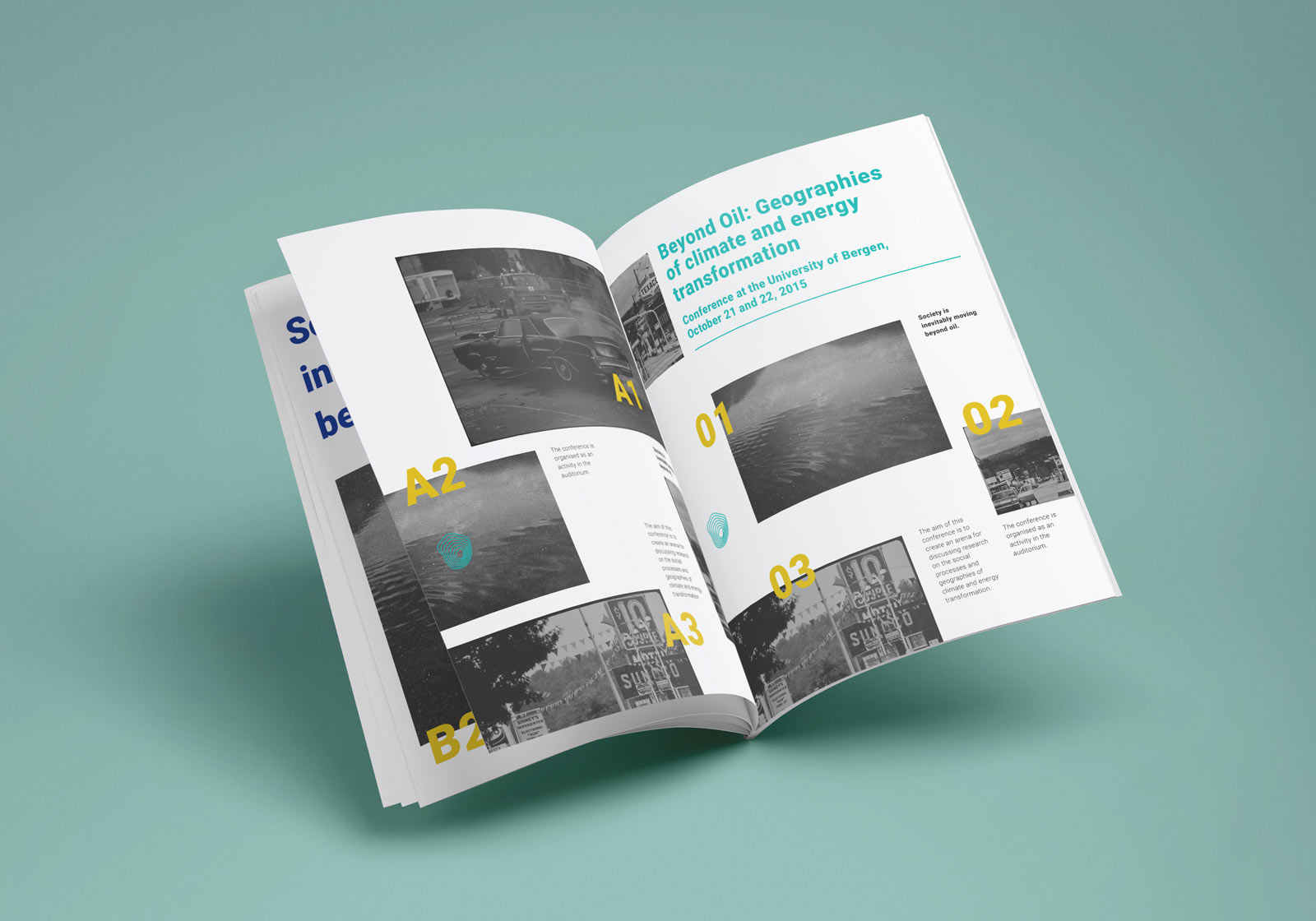
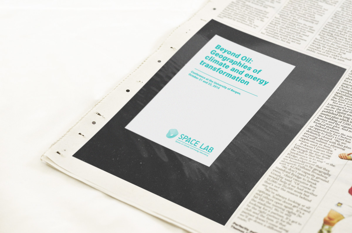
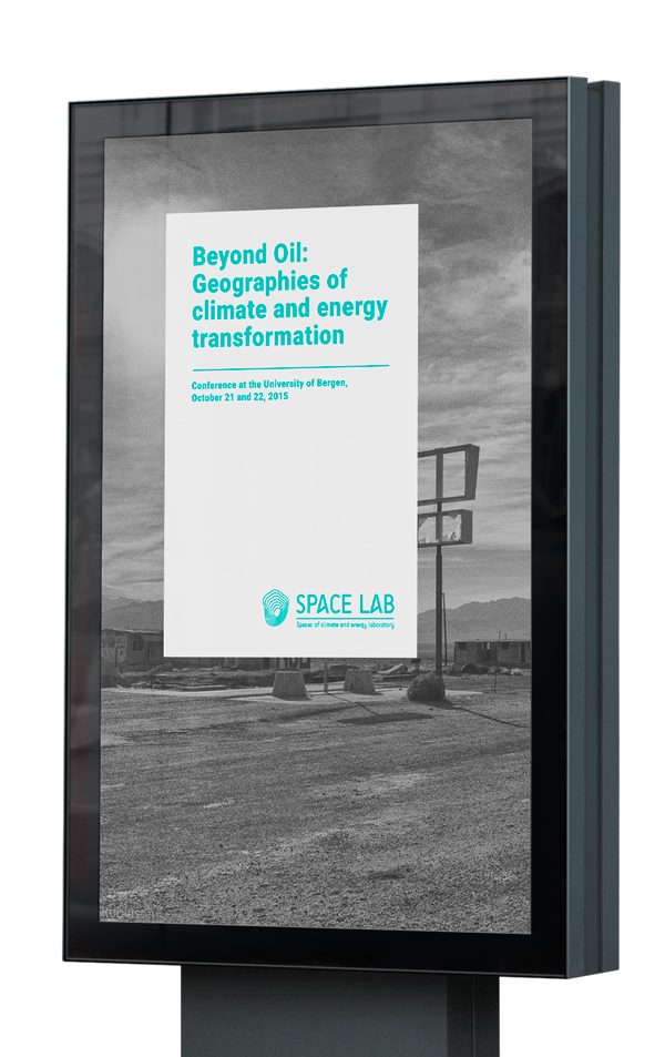
 The Spaces of climate and energy laboratory (