
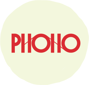
The Phono festival is one of the largest festivals in western Norway, held every year in the fall.
In previous years they used to change the entire identity annually, but after my version, they decided to make my base identity permanent, and invite artists to create new posters and graphic styles for each year.
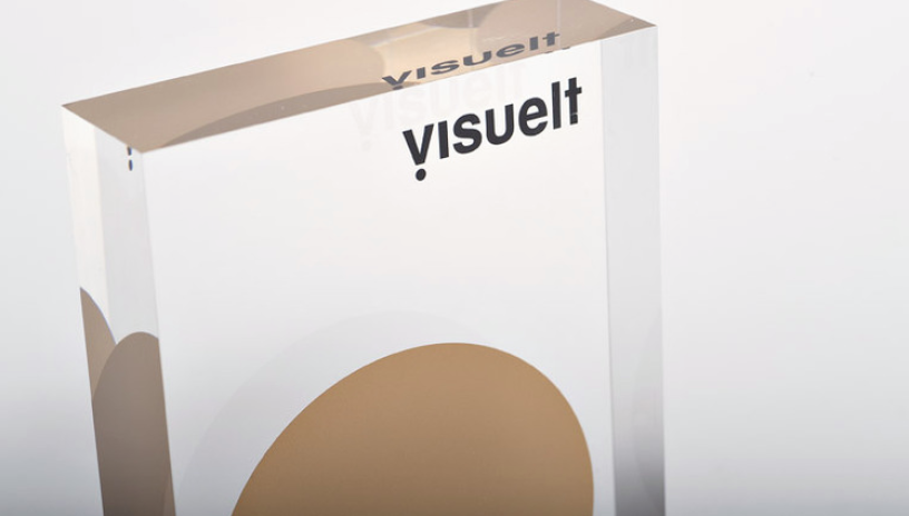
This project also received gold at the Visuelt design awards.
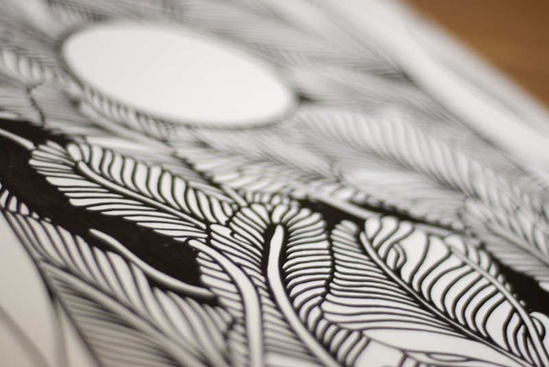
One of my starting points was that I wished to mix together two looks – a very old school, opera ticket style, with a modern, intricate, super detailed design aesthetic. I quickly found Forum, a great typeface by Denis Masharov to solidify one end of that spectrum.
With Forum as the main typeface, it’s important for the logotype and other stuff to go nuts in the opposite direction.
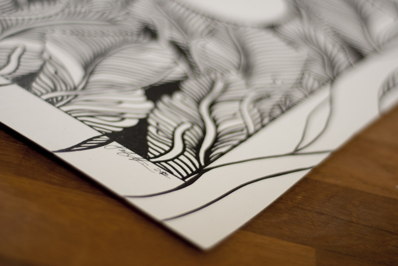
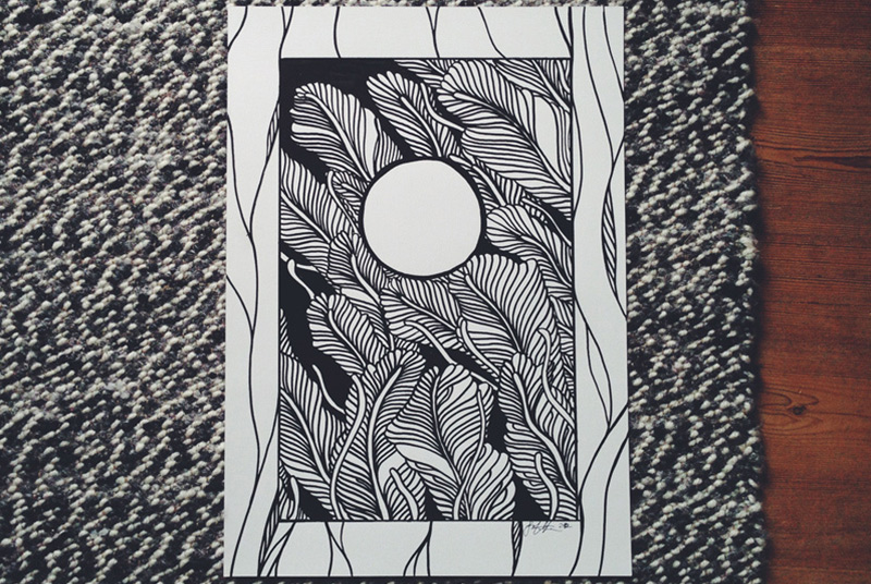
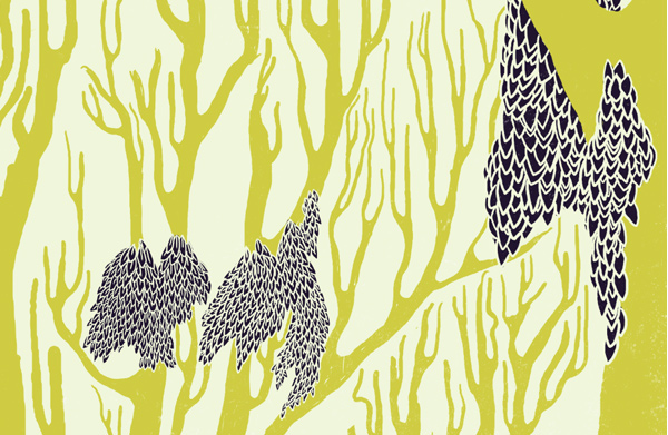
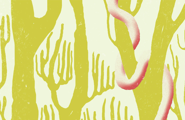
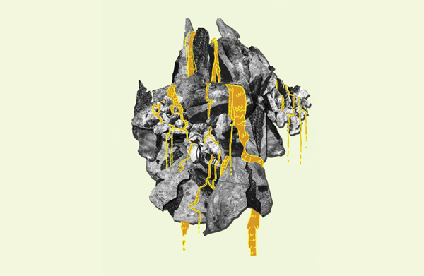
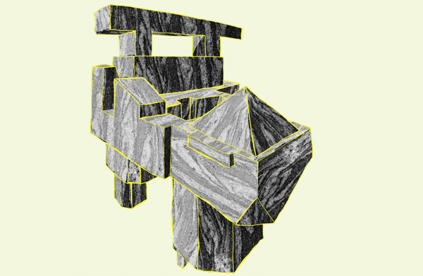
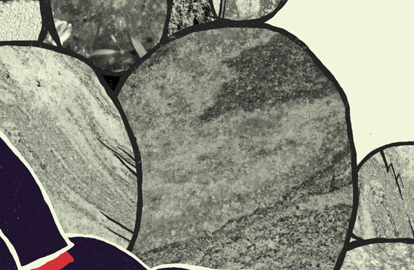
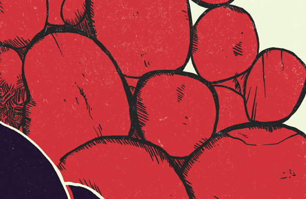
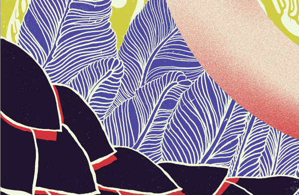
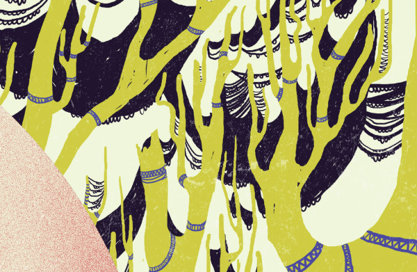
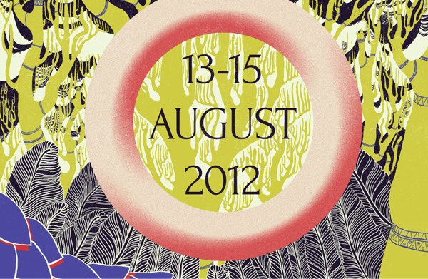
Then it came time to do the teaser poster, to be released months ahead of the festival itself. I started making a series of technique studies, to really nail the style I was going for. You can actually buy the originals, if you want.
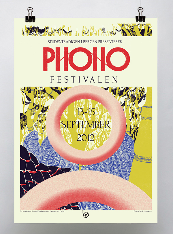
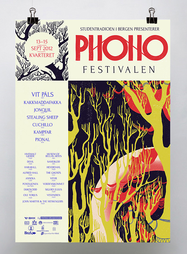
Posters; the promo poster released 6 months before the festival, and the main poster showcasing the acts. These are available in the shop!
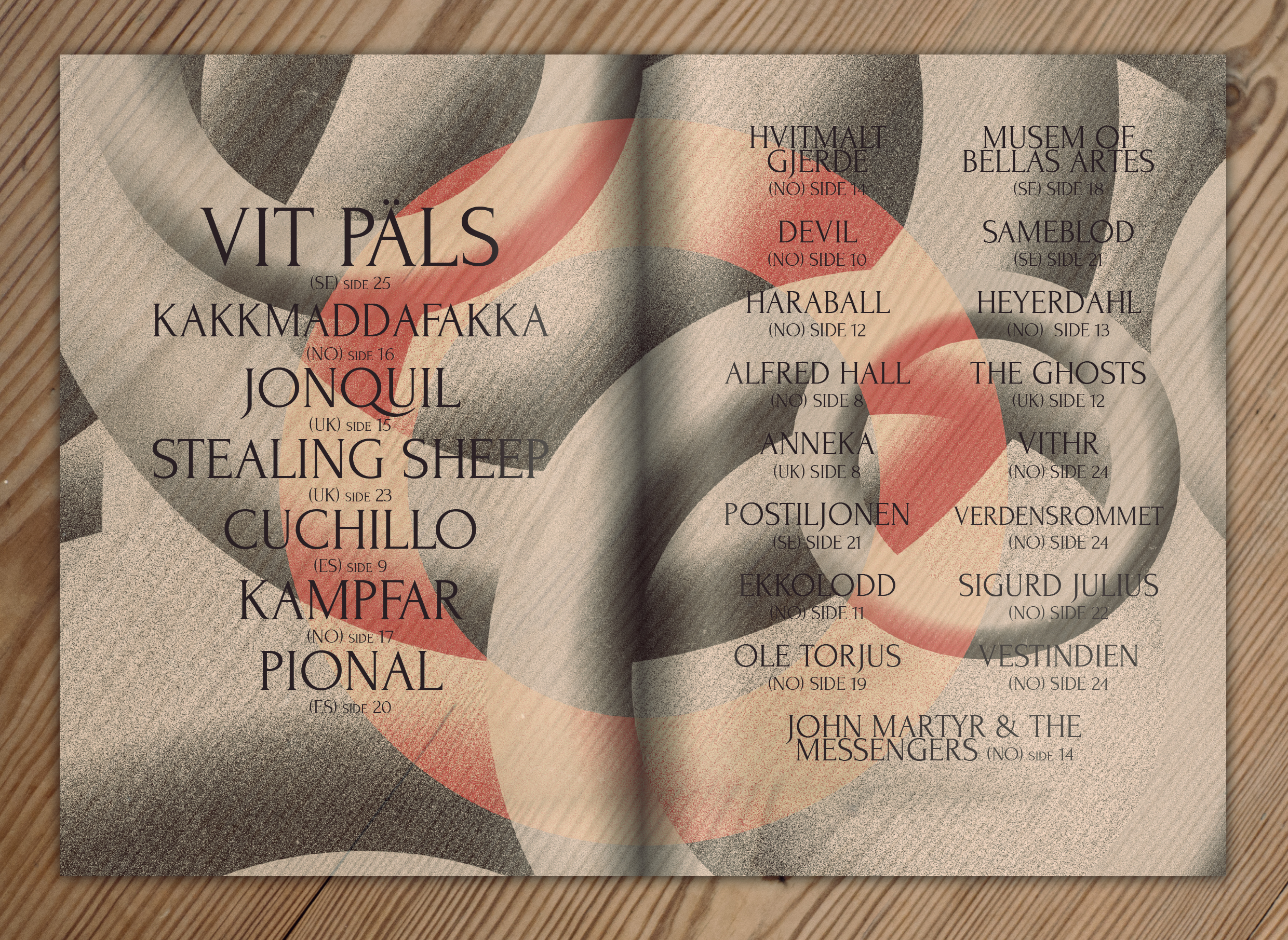
Spread from the festival programme
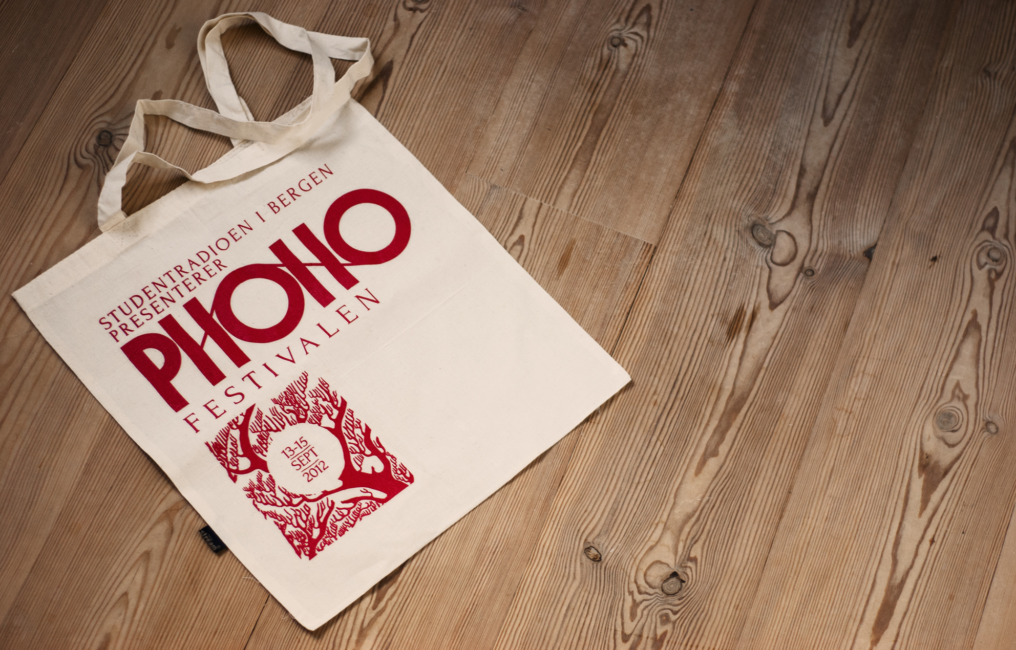
A part of the merchandising: Tote bags, with elements continued from the poster.
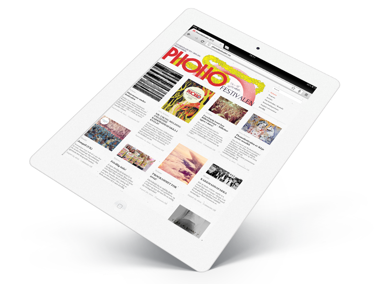
You guessed it; website.
Thanks for watching!
[et_bloom_inline optin_id="optin_4"]