
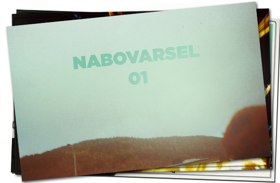
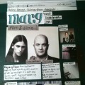
Today is the day the first edition of the Nabovarsel magazine is released!
We have been working on this thing for about five months now. The bulk of the magazine is made up of some brilliant articles and photos, cooked up by the most brilliant young minds in Bergen, nothing less. Headlining is the biggest, baddest city guide to Berlin you have ever seen, covering ten years of club culture.
We also have gotten rather huge amount of DJs from the whole country to chip in and name their top 10 tracks between 2000 and 2009. Some safe cuts, some suprising ones, lots of great music. Just over fifty pages, it’s a pretty solid piece of work, if I may say so.

If you are unaware of the existence of Nabovarsel, it is a music and culture collective based in Bergen, hosting parties and various other events, managing several artists and bands, and we even have a podcast, featuring mainly mixtapes from Norway’s best DJs. Branching out, we figured it would be great fun to make a magazine, too.
My role in this project has been in the design department of course, being head designer on the whole rag. Keep reading for some design jibberjabber!

We decided from the get-go that it would be a digital magazine, distributed mainly by way of usb sticks, sold at bookshops, record stores and the like, as well as at all of our events, where you can also bring your own usb stick and get it transferred over. And before you ask: yes, this is an extremely limited distribution technique. The idea is that the mag will eventually make its way online, but that will be out of our hands anyway. This first edition is all about trial and error, future editions will probably be more polished on this end, we’ll see.
Since it’s an E-Mag, this was all pretty new to me, as it would be to most people. I’ve done plenty of design for print and web, but combining these to contradicting paradigms gave me no easy answers early on. Most people would read it on a laptop, so the page format is based on the most regular screen size out there, the 13-inch. If you really, really want to you can print out the magazine and read it on dead trees, but you shouldn’t have to. Making 2000-word articles be readable on a screen sounds hard if not impossible, but I think I’ve made some headway in the right direction. Get the mag for yourself and give me some feedback, won’t you?
Future editions will maybe be compatible with iPads and all that, but where I come from the iPad constituency is made up from douchebags that wouldn’t read a book to save their lives anyway. So we’ll see.

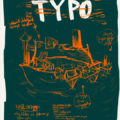
Now, for the inevitable choice of type:
Chuck Bigelow, the co-designer of the Lucida family of typefaces (with Kris Holmes)–suggests several ways to choose type that is easiest to read on-screen.
First, he suggests considering sans serif faces for body text. “When printed, the serifs on typefaces are only a tiny percentage of the typeface’s design. But on-screen, in order to display the serifs using the limited number of available pixels, they take up a much bigger proportion of the information than they do on a printed page. Serifs should be small things–but on screen they become big–no longer visual cues but noise–distracting chunks of interference.”
In the end, I actually went for a slab serif, believe it or not. I made a reading test (click to see it as a pdf) with the most promising typefaces, and distributed it amongst my friends, both typography nerds and not. Pretty much everyone said Caecilia was by far the easiest on the eyes. And so that’s what I picked, conventions be darned. Plus I can disregard the part of the argument about pixel size, since the type is set at 14 points, which is… huge.

So, when all is said and done, I really hope you all try out the magazine, if you can’t get your hands on one of the memory sticks, try googling around for it, someone’s bound to be pirating it somewhere. And tell me what you think!
EDIT: The magazine is now available for digital purchase over at our web store. Go check it out!
By the way: NATT&DAG did an interview with us, if you read Norwegian it’s over here.
<3