Feb 8, 2010
I was asked by Emilio, grand master of Nabovarsel, if I wanted to contribute to their forthcoming publication. This gave me the chance to work more on my editorial design skills, so I was happy to oblige!
This project is a bit special though, the entire publication will be distributed strictly digitally, through usb sticks and the web. Thus, the magazine must be optimized for being read on-screen, and potentially printed out by the readers, if that’s their thing. The brilliance about this is that when you’re not bucked down by print costs, you can fill up the magazine with tons of good stuff, and not have to worry about the price.
Future editions will most likely work with the ipad and its similar incarnations, too. We’ll see.
UPOP.no has a case on the magazine, here.
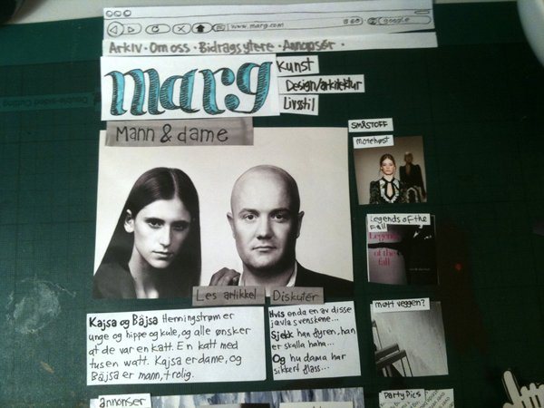
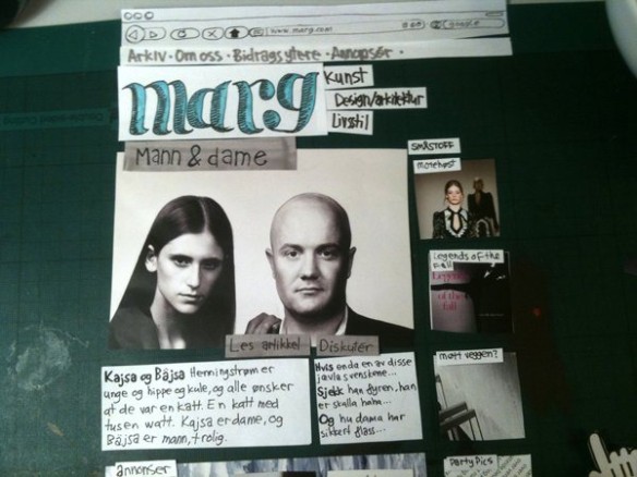
This is some work in progress, for an article page. Click to enlarge.

Nov 30, 2009
Our editorial design project at school has finally taken us into the realm of the digital.
We have been hard at work designing a magazine for the last few weeks, and now it’s time for the webmag/blogazine version. This is by far my favourite part of the project, as I dabble in these things on a daily basis.
(more…)
Oct 2, 2009

Finally the fruits of my labour recently, namely this site, are ready to be shared. I have made the theme i made for this place freely available to you all, if you wish to adopt the same look. Read on for some techno babble about building web sites! (more…)
Aug 26, 2009
Hooray! The brand new version of my site is now up and running!
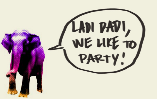
I spent a lot of the summer building this thing. It might not like look a spaceship on top, but trust me, under the hood this thing is an intergalactic juggernaut. The whole header section is designed as a blank canvas, that funky elephant (made for an event in 2008) is just the starting point. More after the jump! (more…)
Aug 23, 2009

Sorry about leaving you hangin for some time now without any posts, I am currently developing a whole new look and feel for this place, which will hopefully roll out soon. be sure to check back in a little while, and everything will be much prettier.
If you have a hardy stomach, you can see how it’s coming along as i build it over at jacoblysgaard.com/wptest. But please, don’t take it seriously just yet. Most of the graphics are placeholders anyways.