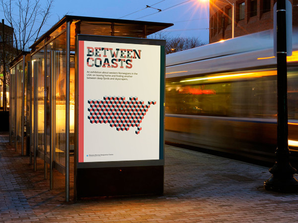
I just finished the design for Between Coasts, an exhibition that opens in Trygve Lie gallery on Manhattan march 21st. It will be a travelling exhibition, and move between galleries across the continental US for two years, before heading to Norway for a tour here.
The exhibition is centered around the stories of various people that moved from western Norway to the US in the last 50 years. On the project, I worked with project coordinator Åshild Thorsen and space designer Hanne Steien, with myself on the graphic design.
Most of the work consisted of a poster, invitations and a pamphlet, as well as the over-arching identity system and logotype. It was a thrill to work with an exhibition again, and with such a lovely team!
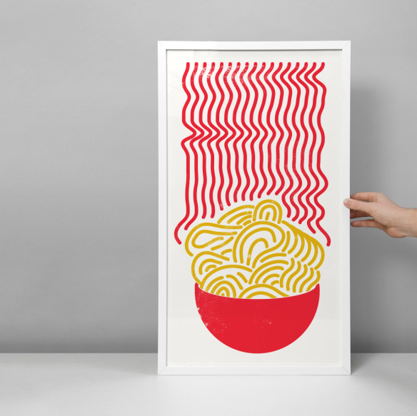
Untz Untz, a record label run by two friends of mine in Bergen, are about to release a single for Njaal, which is a guy you may have heard about before around here. The cover art was done by Uniforms and Dropouts, and label boss Eirik asked me to help out with the typography treatment. And I am happy to oblige, of course.
It’s worth to note that this is my all-time favourite track from Njaal, so I’m very happy to be part of it in any way. I’ve used early pre-released versions of this track as secret Dj weapons, and watched the audience go nuts to these beautiful arpeggio lines. I mean, just listen to it!
This is the first version I did, taking the dirty cover around for a spin with some glitter. The idea of fake gold I thought had a good connection with the rest of the cover. The typeface is Airship.
In the end, I would up going at it from a different approach, to try to match the grittiness of it instead of contrasting it. Typeface is Tondu, here goes.
In other, more personal news, things are going just dandy here in Copenhagen. I’ve made lots of new friends, and the hunt for clients and friendly agencies is going good. I just had a great meeting with Nille from Goodmorning Technology, and I’m meeting lots of cool folks over at Likemind.
I’m also keeping pretty busy with several projects that you will hear about soon on this very blog, so stay tuned and you’ll hear all about it!
We just finished a project in Expressive typography at school, and here are my results.
The class was basically about finding your way of expressing type, making the visual presentation synergize with the actual word, in a way. So i chose the word Techno, as is is a word I can easily put ideas on top of, it’s a word I am intimate with.
The video is meant to show the technical and artificial, that are being given the human element; thus creating what we call techno, in music, art and so on. Big words, huh?