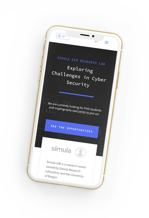
A new digital dawn for Sammen

Sammen
Sammen
Sammen

The Student Welfare Organization Sammen provides services at various study locations throughout the West Coast of Norway.
These services include student housing, fitness centers, cafeteria operations, and a range of welfare services. Sammen needed to consolidate all its services into a unified platform for 45,000 students.

Sammen manages around 6,000 housing units, has 20,000 members across 10 fitness centers, operates over 40 dining establishments, and serves more than 45,000 users.

Their challenge was the highly fragmented nature of their solutions for students, with one system for fitness, one for housing, and five variations of websites – one for each location. Students struggled to find the information they needed, having to navigate different systems for various aspects of Sammen’s service offerings.

Challenge

Sammen is the student welfare organization for the entire West Coast and serves nearly 45,000 students, offering a wide range of services across multiple locations. However, the systems are minimally synchronized, and users of different services must navigate between several external platforms and third-party solutions to manage housing, fitness, food, courses, and many other services. The service offerings vary between districts, making it challenging to present accurate information to the right user. The websites are difficult to keep track of, leading to duplicate content, exacerbating the problem. Lack of information among students has resulted in an increasing volume of inquiries and questions that Sammen must address.

Solution

The project was established with three parallel tracks:

  • One track aimed to improve collaboration across locations and cities within the organization. This involved implementing virtual teams and introducing a new case management system to empower employees for enhanced user service.
  • Another track focused on system architecture, building an intermediary layer for all services in the cloud. This allowed for a unified login for all services, maintaining control over the data, and enabling control over how the services are exposed.
  • The third track concentrated on information architecture. Based on user insights, a new structure and design were developed for all service areas, designed for continuous evolution with new features and led by a core team within the organization.

All tracks are managed through a common digital roadmap prioritized based on user insights, technological possibilities, and strategic priorities.

Result

The result is an entirely new website with the scope reduced from over 3,000 to approximately 250 pages. Simultaneously, Sammen also established a unified contact point for its services across locations, providing customer support with a significant boost.

Time will tell if we reached our KPIs! 

88% av alle henvendelser er nå løst innen én dag, og lanseringen gikk smertefritt — på tid og budsjett!

Geir Nesse
IT-sjef, Sammen

Jacob lagde kreative og innsiktsfulle konsepter som virkelig tok brukerne på alvor. 
Vi er SÅ fornøyde med de nye nettsidene våre!

Marita Monsen
Kommunikasjonsdirektør, Sammen

Project Leads
Martin Claussen og Torstein Utne

Service and User Experience Design
Jacob Lysgaard &
Ingfrid Daland Næss

Development
Øyvind Øyen,
Nicholas Mowatt,
Espen Eika

ScaleAQ Brand Development & Website

ScaleAQ brand development & Website

In the wake of the merger of Steinsvik, AquaLine, and AquaOptima, ScaleAQ has emerged as the world’s largest services and equipment supplier to the aquaculture sector.

As part of the team at AG& I was lead designer on the project. With a core visual identity already in place, our job was to further develop this into a design language for web and many other mediums. With my background we were also able to develop and produce their podcast — to codify the brand, drive the internal sense of ownership, and stake out a course as market leader in the industry.

The website has to serve many functions for many different customer groups, not to mention five languages — which presented some interesting challenges to create new intuitive UI concepts.

product page

Simula UiB Identity & Website

Simula UiB Visual Identity & Website

The website was a big part of this project, so you might want to check it out right away!

Simula UiB is a research center owned by Simula Research Laboratory and the University of Bergen, specialising in cryptography and information theory.

Let’s take you through our process from the start:

We started by defining the different fields of study Simula UiB specialise in, and creating a language of symbols to give these otherwise intangible concepts some visual cohesion. Each course is represented by a hex and is given its own symbol.

dat103

Computers and Operating Systems
HVL

inf142

Computer Networks

UiB

inf143

Security in Distributed Systems
UiB

inf144

Information Theory

UiB

To bring all the parts together into a whole, we gather the hexes in a unified shape, to act as the top-level emblem.

This also roughly symbolises their two main fields of expertise: Collection of data, and the selective showing of data.

We then played around with these shapes to create various properties like patterns and background elements.

Our goal was to create a typography-driven website that would be serious without being somber. Something that communicates clearly, but never without some sparkle in its eyes. Go check it out!

In this process we were lucky enough to build the website and the visual identity in parallell — this unorthodox way of working lets us be very agile and continually test out ideas for what works and what doesen’t.

If you have a great idea for the identity, you quickly get to stress-test it when you implement it, and observe what happens when it is viewed on an old phone or in low-earth orbit.

Thanks for watching! Be sure to let us know if you want to discuss a project or talk about the weather.

<3 Jacob

DOT Identity

DOT
1.0
introduction
The DOT profile has been one of our passion projects, as we saw a huge potential in their work. Here lies an opportunity for an authentic, geeky and hugely popular brand we believe — and working on this has been an absolute pleasure from the first conversations to when the merchandise is worn at every festival. DOT is an event organisation, deeply embedded in the culture of the Norwegian Electronic music and clubbing scene. In record time they have built up an audience and a reputation on the scale of European majors, but have lacked a unified design system and a visual cohesion to go with it. After some preliminary talks, we decided to commission them in constructing a mission statement — a short document detailing their goals and intent:

MISSION-STATEMENT.txt

We believe people want unique experiences, discoveries and adventures. Both pleasant and provocative. We believe in being challenged. That’s why at DOT we work towards a mix of music, dance, visual art, physical art and inventions. We want to combine all of it, putting the full experience to the test. The DOT family is about experimenting with interiors, techniques and narratives. DOT is about new spaces. And we hope to meet you there. DOT is a collective of artists, DJs and organizers. We make techno events in its broadest sense.

Phase 1: initiate

We now have a clarity of intent. Using the parts of the statement that I outlined, let’s start a process in four parts:

1.1: “DOT is about new spaces”

Starting with a cube, representing space, we express the wordmark on a simple pixel grid, reminiscent of early computing.

1.2: “Provocative”

Compressed and simplified, the wordmark becomes increasingly distinct and illegible. It should be a little hard to decipher, but once you get it, you’ll remember it.

1.3: “Experimenting”

The wordmark is run through a series of processes involving printing and re-digitization, releasing it from the grid

1.4: “Family”

DOT is about being a safer space, where no-one should need to look over their shoulder. We incorporated a holding shape from Japanese heraldry to indicate a family crest, where everyone is welcome.

typography
Eurostile Bold Extended in all caps worked wonders when we «beta-tested» it at an event. Bombastic yet humanist, with references to early rave parties and subversive culture. It was the official typeface for the Norwegian police for a long time after all, not to mention a plethora of science fiction films.
ida nerbø am-talis the arbiter josh wink miss mostly
To subvert the only limitation of Eurostile (its massive width), we elect to break the first rule of typography school — DO NOT STRECH THE FONTS. This allows us massive freedom in choosing emphasis in layouts, such as line-ups on posters.
Colors
With implementations and printing methods spanning from computer screens to Riso machines, setting too many rules would be hard to follow. We therefore have quite lax rules about colours to begin with: Keep them limited, make good choices. Since we will be working closely with DOT going forward, we have time to experiment. In time we will no doubt see some hues that stick out and become our signature.
Thanks for watching. Be sure to let me know if you have questions, need a hand or would like to discuss a project! You can reach me at +47 41674867 or via hei@jacoblysgaard.com

Apache identity & website

Prose is architecture, not interior decoration.

Prose is architecture, not interior decoration.

Apache is a startup team of writers specialising in content marketing. We developed their identity and website, starting at the core of what they do — stories.

%

more leads than with traditional ads

%

of the cost compared to traditional ads

times the conversion rate compared to traditional ads

Historier.

From the absurdly heaviest of headlines to paragraphs chiseled by nanomachines
When all the designer-speak boils away, we have to let the actual product shine through — and in this case, that’s mostly text. And when you write all sorts of things for all sorts of clients, that text needs to look equally good as ad copy for a toy magazine, as an in-depth article into the wonders of Sous Vide cooking.
Our type system is based on the combination of the modern and gutsy Integral, with the understated, timeless, great-in-every-size Garamond. We picked the EB cut, as this is optimized for legibility on modern screens, and is served up nice and fast from Google’s own font library. We dare you to find a situation that cannot be served by this power couple.
Website
The website is fully responsive and adapts its content to fit different use cases. Wowing visitors with fancy animations is far from enough to convert new customers, as both we and Apache knows well. So we show some core numbers that make the added value of their services fairly obvious and showcase their biggest selling points, such as their efficiency and no-BS attitude. For those willing to dig deeper we have an archive of past work to look at, and punctuate the experience by clear calls-to-action urging visitors to get in touch.