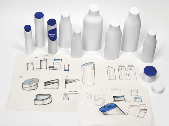
I just wanted to share and write a few words on the new iteration of the Nivea brand, done by San Fransisco-based Fuseproject. It builds from the brand’s original product from 1925, the iconic blue Nivea Créme tin. I don’t know about you, but that blue tin was a staple in our bathroom throughout my childhood.
In a world where more and more brands try to look like detergent, Nivea have dared to unify and boil down their packaging to this. And for that, they should be applauded. The lids of the packaging is a really nice touch, letting the top be angled towards the end user on the shelf. Now let’s have a look.
A video with Yves Béhar talking about the new style after the break!
![]()