
As you may have noticed, I regularly post images to my inspiration blog Adrian, that you see a small feed from in the sidebar of this site. In this post, with content from Adrian as examples, I’m trying to delve deeper into that material, and show you how I look at the material I see every day.
It is a common myth about all designers, musicians and artists in general that all of our work comes purely from a mental connection to the cosmos; as an artist and “creative person” we just make stuff completely out of nothing. However, nothing could be farther from the truth. Whether one is aware of it or not, we pick stuff up from all around us all the time.  Some artists claim to be 100% original in all that they do, my proposition is that they simply are unaware of how they acquire their inspiration.
The “Ether” is a more fitting description than the “cosmos”, I suppose. Some things are just floating around, and we end up picking it up often without being aware of it. One of the more established definitions of the word creativity is the ability to see connections where no connection seem visible, which is exactly what this post is about. The most important skill taught in art school is in my opinion, is the ability to see how and why something is inspiring, and so be able to draw inspiration from nearly anything, by analyzing it.
The inspiration blog I keep mostly as a tool in my own creative process, as a toolbox of ideas that can be tweaked and hopefully made better in my own work. I have one basic rule: I’m not posting images, I’m posting the idea behind the image. Also, the idea has to be actionable. Let me give you an example.
 This is an ad for the computer gaming company Atari. A really good and clever ad, I think. But the idea behind it is not at all actionable, how can I translate this into my own work? The juxtaposition of real-life sports and computer game sport is applicable only in this one setting. So if the goal is to simply showcase and honor the ad itself, go for it. But extracting something useful out of it can be hard. Of course, you can break down the idea and think about the real vs the virtual and so on, and that could get you going in some direction with what you are working on. But you get my point, the analogy only goes so far, I suppose.
  This, however, is an example of how to do it right. These African masks gives me the idea of making masks for other people, perhaps painting rough masks over photographs, as this may even be (hard to tell from the photo). Some time ago, I drew some complicated, ornamented viking helmets on top of photos of modern-looking people. Hardly 100% original in concept, but plenty original enough if you apply enough of yourself into the equation. Now let’s look at some good ideas, shall we?
  Poster for the appleseed cast, designer unknown. I would love to try putting similar geometric forms over different types of photography, to augment the color and shading of it. I’ve been using a lot of point raster in my own work lately, and this line raster technique could be fun to try out.
  Cover art for Tame Impala, designer unknown. The band’s album Innerspeaker shares a similar look. There has been a visible trend in graphic design to mirror and do kaleidoscopic effects with nature photographs lately, which yes, can give some really pretty results, but also gets really boring after a while. So I’ll let the ruling idea behind this be the abstraction of natural forms in general, as well as a really pretty color palette.
  Aerial photograph(of a parking lot), source unknown. This simply looks stunning to me. With some uncomplicated photoshopping, you could make a magazine layout based on this (or a similar) photograph, it could be the starting point of a typeface or any bold typographic composition. You could also use images from corn fields (with or without crop circles) to let large planes of color dictate the work.
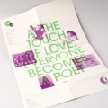
  I’ve been sketching on some ideas for different type-based posters lately, and this is a prime example of it done right. These posters can be anything, lists of nice things, motivational posters, “ten commandements”-style posters, anything. And who said it had to be a poster at all?
I don’t know about you, but I find it far more giving, having this approach to what I choose to be inspired by. We are constantly being bombarded by images without context or analyses on sites like Tumblr and Fffffound, which only ends up draining us of creative energy and further shortens our attention span. These sites, and the thousands like them, can be an invaluable tool, but as any tool, is often used wrongly.
Also, being exposed to the best work from a plethora of different sources and authors only end up sapping your own confidence, since the aggregate skill of all those people seems infinitely larger than your own.
What do you think about all this? Is it worth the extra energy to ponder and analyze, or do you like best to watch as the shower of information rains past? How do you attain your own peace of mind in the information blizzard?
Hi thanks for the article I just started a blog on mosaic art I am trying to find similar blogs to comment on and leave my link. This was my sons suggestion and he did not say it would be this difficult lol. Well if you have a moment please give me a visit.