
Our editorial design project at school has finally taken us into the realm of the digital.
We have been hard at work designing a magazine for the last few weeks, and now it’s time for the webmag/blogazine version. This is by far my favourite part of the project, as I dabble in these things on a daily basis.
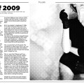
The magazine we designed in “part one: paper” is a bi-monthly addition to the regional newspaper, BT. It’s centered around art, design and architecture, although it should appeal to as much as possible of the regular BT readership, being middle-class folks between 25 and 60, mainly.
We played around a lot with different formats for the magazine, settling on an strange but easily-read one that allows for huge pictures and featured editorials, but still with ample room for the small stuff, like the normal gadget and who’s-wearing-what-pages. I’ll try to fix some pictures of that design later on.
When porting this concept to the web, I tried to analyse the core principles; the distinction between the large editorial articles/posts and the smaller stuff, and incentives for the user to engage in the conversation, through comments and so on. The user-driven discussion is really important, as the main features for the paper edition will be previewed online first, so that parts of the discussion can be printed alongside the feature when it goes in the press.
This is where it gets complicated though, several mechanisms must be set to work to avoid trolling. For example, commenting could be limited to subscribers, while everyone can read. A degree in psychology would be really nice at this point.
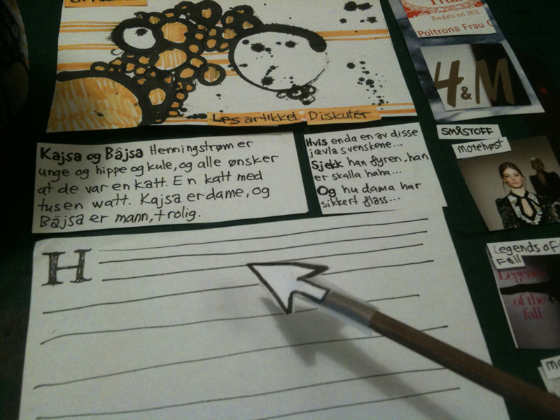
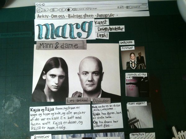
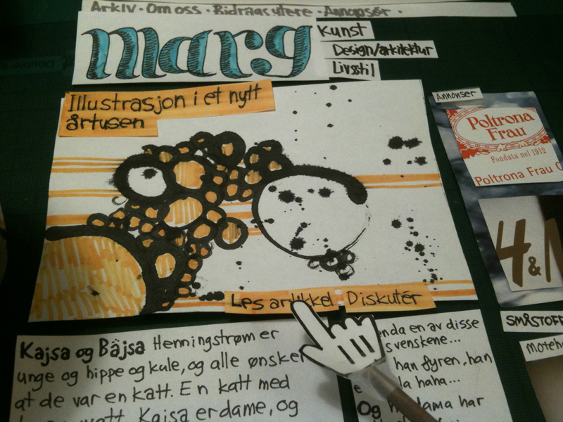
Now, let me explain the images of my brilliant paper prototyping a bit:
The main feed is divided into two; the heavy articles on left, and the smaller, less prestigious stuff in the right column.
Right underneath the image for the main article you have the intro for the article, and a sample of the latest comments on your right, with buttons to read it, or jump straight to the comments section.
Below all this is some ads, just to jazz things up and make it harder for my self. Ads are always a party pooper when making web sites, and generally of course. Then the main feed continues with the last big articles in a pretty standard blog format with thumbnails.
One of the cool things i like to take credit for, is the inclusion of sampling the headline color from the attached image. You see this all the time in printed media, as the colors for the typography is sampled from the pictures in the article, but never online. Alas, innovation! The best part is that this feature is easily implemented by ways of a small wordpress plugin that lets you choose a color scheme for each post.
This idea is inspired by the recent online surge of custom designed blog posts, smashing magazine has an interesting article on this. Designing and coding each article individually is clearly impossible when maintained by a desk of journalists on a daily basis, and so this is my compromise, letting it all follow the regular grid, but introducing an element of “theming”. Local webmag UPOP (designed by Luftmensch) has also included this to some extent, choosing a different background color for the entire site with each main feature.
Updated:
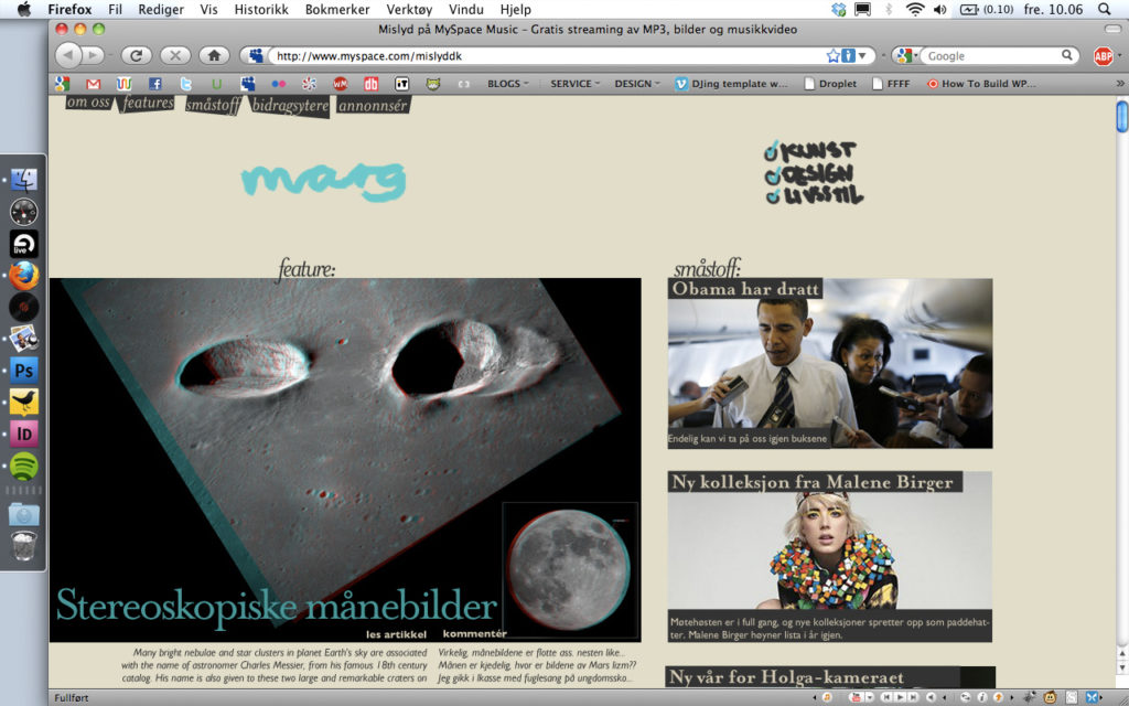
These are digital wireframes so to speak, of the page structure and so on. I hope to get to work more on the visual look of the whole thing, as I’m not entirely satisfied with the way it is on the eyes. But the structure and layout works now, my grid should be quite solid. So through the week I’ll work on getting the drawn visuals and the regular type to work out, getting the color scheme running, and just general polish.
More update:
Polish on the web edition is finished, you can see a in-browser version at jacoblysgaard.com/marg. I haven’t bothered setting up a stylesheet for it, so if you’re sitting on a big screen it won’t look right. But you’ll get the idea.
Working on finishing the paper edition now, my head is spinning…
[singlepic id=118 w=320 h=240 float=]

Man, Kajsa har garantert flass…
Likte godt artikkelen fra Smashing, tipper det er mye man kan gjøre bare ved å endre bakgrunnen til siden.
Øh, proff side, forresten 😀
Takk takk =)
Dette var et veldig imponerende innlegg og et imponerende prosjekt. Jeg gleder meg til å oppleve resultatet av dette arbeidet.