Ever since i first found out how to pimp my MySpace profile so many years ago, i have been tugging my hair in frustration. The cause of my woe is of course MySpace’s horrible page layout, it’s never-W3C-compliant-code, and the never ending “an error has ocurred”, among others. But it is the de facto standard for bands and a lot of other things on the web, so we just have to make due.
Don’t get me wrong though. Emo kids aside, MySpace has revolutionized the way we look at music on the web, and finding new bands to listen to is ever-increasingly fun and easy. Not being represented on the space of spaces is ridiculous, any good band knows not to say no to free advertisement.
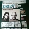
My main DJ alias, Totem, has had a myspace page since 2005, from shitty glitter to glorious GIFs. I revamped the entire page recently, being to embarrassed to have such a horrid thing represent me professionally, trying to make it more simple and striking, but still using myspace’s usual layout to help people navigate. I wrote the whole thing in dreamweaver (with photoshop doing graphics) to control the code, and the result is a piece of HTML markup that even your grandma could read and make sense of.
Now, where am i getting at, where is the newsworthy item?
The thing is, my main club, REWIND!, has been in dire need of MySpace representation for some time, and now i finally got around to it. Since my other page was just finished, i simply took that design, snazzed the color scheme around, and there you have it. It’s not revolutionary design, but than again i’m not trying to do that. I’m just a brother trying to make something that loads fast and looks pleasing, cool?
Now that i said all that, you might want to take a look:
here’s Totem, and
here’s REWIND!
Comments and feedback is appreciated, as i haven’t tested this in every browser out there yet. Bugs should be minimal at least.